CLIENT
Pario Land Development
INDUSTRY
Design and RE
SERVICES
Brand Strategy • Brand Identity • Positioning & Messaging • Digital Design & Development • Copywriting • Social Strategy & Engagement

SITUATION
The Challenge
Pario Land Development approached us to craft a full brand strategy and visual identity for the launch of their new residential and mixed-use development company. The name Pario, Latin for “to give birth,” was already established, and they needed a compelling identity system, website and social presence to match their bold philosophy and forward-thinking vision.
PROCESS
Strategy & Approach
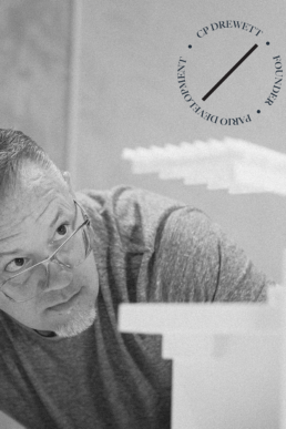
With one of the founders being highly tactile and hands-on, the brand needed to feel tangible, intentional, and crafted. The Peregrine Falcon was a symbol of interest—fast, precise, and powerful—but abstracting it in a way that aligned with Pario’s high standards and distinctive personality required a thoughtful and unique approach. The brand also needed to visually distinguish between the people behind the work and the work they produce.

RESULTS
Final Experience
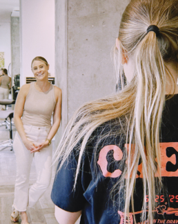
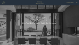
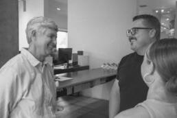
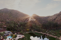
We turned to the art of origami to extract the brand’s identity—pursuing renowned origami master and former mathematician Robert Lang to create a custom falcon sculpture. This became the anchor of the brand. From there, we built a visual language around it: the website features timeless black-and-white film photography to highlight Pario’s expert team, contrasted with bold, bright colors that showcase their vibrant, modern projects. This duality captures the heart of Pario—crafted precision and dynamic execution.